Which UI Is More Accurate? Exploring Color Selection Patterns in E-Commerce
Sahil Ali Salmani explores how color selection patterns impact user decision-making in e-commerce interfaces. Through a large-scale UX research experiment, he analyzed user preferences, validated design assumptions, and uncovered insights into product discovery, usability, and information visibility.
By Sahil Ali Salmani 1 min read
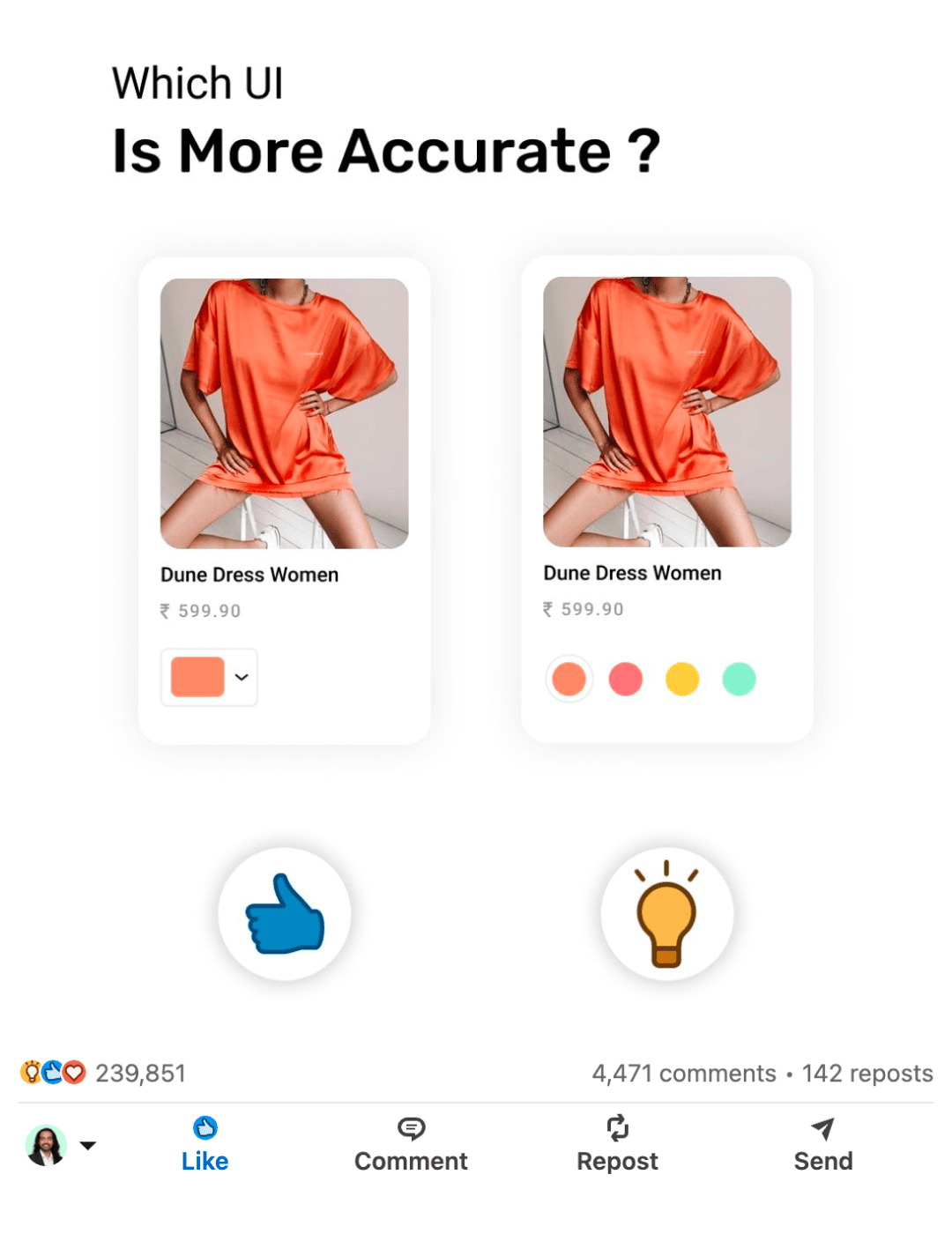
While browsing e-commerce platforms, I noticed that products with multiple color variants are often represented using different UI patterns. Some interfaces display only the currently selected color, while others show all available color options at once. This led me to a simple but important research question:
Which interface helps users better understand product availability and make faster decisions?
Research Approach
To explore this, I designed two product card variations:
Version A: Displays only the selected color with a dropdown selector.
Version B: Displays all available color options directly on the product card.
I shared both designs with the design community on LinkedIn and asked users which interface felt more accurate and intuitive. The objective was to gather qualitative feedback at scale and understand how visual representation impacts user perception.
Key Findings
The majority of participants preferred the version that displayed all color options upfront. Users felt it provided better visibility, reduced uncertainty, and helped them understand product variety without requiring additional interaction.
The experiment reinforced a fundamental UX principle: making important information visible reduces cognitive effort and improves decision-making.
Impact
The post generated significant engagement, receiving over 240,000 reactions, 4,400+ comments, and 140+ reposts. Beyond the numbers, it sparked valuable discussions among designers, developers, and product professionals about product discovery, information hierarchy, and e-commerce usability.
Takeaway
This experiment demonstrated how even small interface decisions can influence user understanding and confidence. It also highlighted the value of leveraging community-driven research to validate design assumptions and uncover real user perspectives at scale.